
I love financial visualizations. My brain doesn’t intuitively make sense of numbers on a page — but show me a diagram, and suddenly the whole picture clicks.
Jump cut to me sitting on a bench outside my college calculus class, on the phone with my dad, in tears. That was always my relationship with math: emotional and confusing.
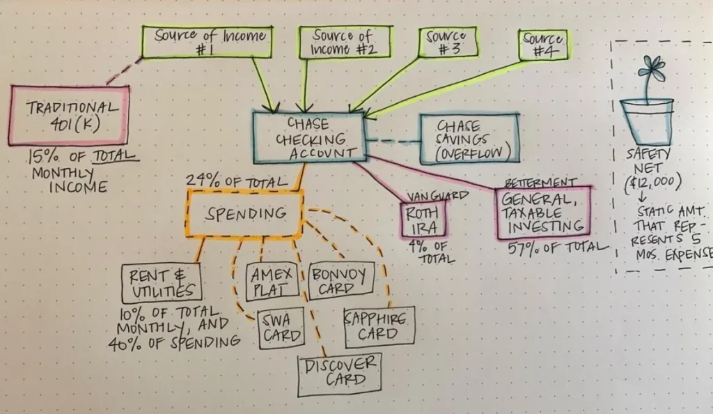
A few years ago, I did an exercise I lovingly called a “Money Map.” It looked something like this:
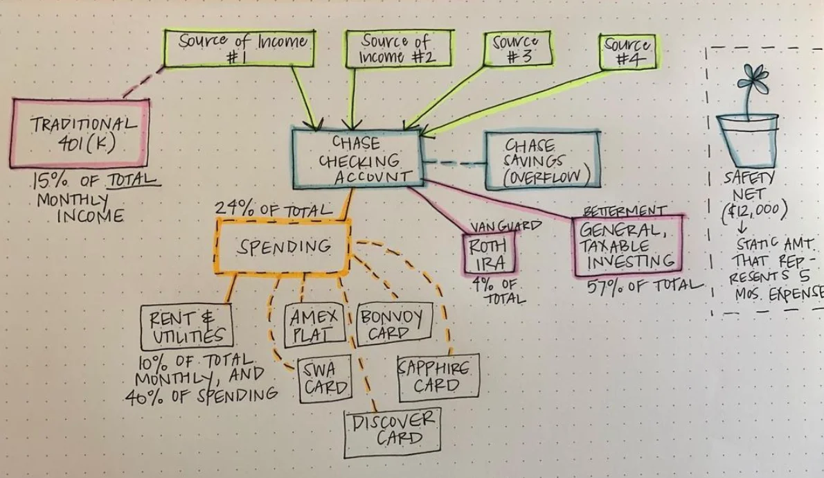
My sincerest apologies for the inconsistent use of dashed and solid lines. I was excited. The point wasn’t artistic perfection — it was understanding.
The problem that led me here
I realized my financial life was becoming increasingly complex. I had a hard time wrapping my head around all the wheels turning in the background, and I wanted to illustrate how money actually flowed through the system.
At the time, I had four (sometimes unpredictable) sources of income, a maximum 401(k) contribution, and no true emergency fund sitting in a savings account. Instead, I used a taxable brokerage product from Betterment called a “Safety Net” that served the same purpose.
So out came the colored highlighters, and I drew it all on paper. The money mapping exercise was born.
If your financial situation is complicated enough that it becomes hard to keep up with — like mine was — it’s worthwhile to take time to streamline how your money flows through your system. Here’s how to make your own.
My 2025 update: simpler, but not boring
I didn’t redraw my old system from scratch, but things have gotten progressively simpler despite adding another whole human to the mix in 2021 (hi, Thomas). Here’s what our financial map looks like now:
- Two sources of income — that’s your starting point, 100%.
- Taxes come out first — subtract about 23%.
- Retirement contributions follow — my 401(k) and HSA (a Health Savings Account available in the US for medical expenses), plus Thomas’s TSP. The Thrift Savings Plan is essentially a 401(k)-style retirement account for military members. Together, these subtract another roughly 10%.
- The remaining 67% flows into our joint checking account.
- Rent and four credit cards get paid monthly — my business card, my AmEx Platinum, my AmEx Gold, and Thomas’s Chase Sapphire Preferred. That comes to about 22% of total income.
- What’s left funds our joint taxable brokerage investment account — around 45% of the total.
See? It’s way more fun with highlighters involved.
Step 1: Start with income
Sometimes we introduce complexity slowly over time as our financial lives evolve around our habits. You start paying rent from one specific checking account because it just happens to be the one set up for withdrawals. Then you open a new account somewhere else but still need to funnel money back to the old one for rent, and so on. It slowly becomes an unwieldy mess.
Some people like maintaining a bunch of accounts for different purposes. I’ve found personally that it drains energy without adding clarity.
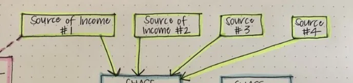
Start your map by drawing cash flowing from your income streams into your central checking account — or multiple accounts, if you maintain joint finances in a “yours, mine, and ours” arrangement.
Your 401(k) contribution (or 403(b), HSA, or whatever retirement vehicle fits your situation) comes directly from the paycheck. Make sure that shows on your map somewhere too.

Step 2: Illustrate your emergency fund
If you’re still growing your emergency fund, draw a dotted line from checking to savings to represent the monthly flow. If it’s already fully funded, set it off to the side to show its “reserve” status — like an account waiting in the wings.
It’s there if you need it, but you aren’t actively funneling money into it right now. And if you have a habit of over-saving while under-investing, this mental separation can help you see where rerouting extra funds might do more long-term good.
You may also be funding other goals — a house down payment, future childcare costs. Draw those as little metaphorical buckets on the page.

Step 3: Add in spending
Most of my spending — necessary and discretionary — happens on credit cards, which I pay off from checking each month. There are plenty of reasons to use credit instead of debit: fraud protection, cash back, travel points. The list goes on.
Sometimes you have to pay something with a direct withdrawal though, like rent. I note those direct pulls on my map where they belong.
Think of the credit card as a buffer between your spending habits and your checking account balance. You shouldn’t need to transfer money from savings into checking just to cover credit card bills — but it’s useful to flag when a big-ticket item bypasses that delay entirely.

Step 4: Draw post-tax investment accounts
When you open a post-tax investing account like a Roth IRA or a regular taxable brokerage account, you deposit money directly from checking or savings. Remembering to do this every month gets tedious.
I used to set up bimonthly auto-transfers for the days right after payday. But in recent years, as my income has become more variable, I tend to check manually at the end of each month and make transfers by hand instead.
What about taxes?
There’s a big missing piece in most financial flowcharts. Can you spot it? Taxes.
Taxes get paid directly from your paychecks, so if you want to note them on the map, go ahead. I did in my updated version above — just to twist the IRS knife a little.
I recently sat down with a spreadsheet listing our income, spending, and total tax burden, and was shocked by what came out: we’ve paid more in taxes this year than we’ve spent on everything else combined. That made me realize it might make sense to hire an accountant to review our tax strategy, rather than stressing over incremental hundreds of dollars here or there.
It also reminded me that now is the time to invest in my business through legitimate write-offs — so I keep a running list of deductible expenses handy.
Creating a sense of scale
You’ll notice the percentages on the flow chart above. If I were really committed to visual accuracy, I would’ve drawn each box proportional to its actual share — and honestly, that’s a great idea worth trying. For my first attempt, which was less than artistic, I just noted the percentages where they applied.
But drawing boxes to scale is genuinely helpful because it reveals whether you’re prioritizing investing in an ideal way, or if there are leaky holes in your budget. If only tiny offshoots go to investment accounts while most of your income drains straight into spending, it makes those purchasing decisions feel more tangible.
It might also help you see where you’re prioritizing certain financial goals much more heavily than others — perhaps in ways you hadn’t realized until everything was on one page.
Why money mapping is worth your time
Beyond the simple joy of pulling out highlighters and touching real paper for a change, money mapping helps you diagnose large trends in your financial life that spreadsheets can hide.
It reveals gaps in your own understanding. When I started filling in numbers on my map, I realized I didn’t actually know where part of my income was going every month. The visual guided me toward solutions I wouldn’t have found staring at rows and columns.
For example, when I saw that 57% of my investing went into a taxable brokerage account, it made me wonder if there were tax-advantaged options I should use first — before filling up a regular investment account. Turns out I ended up contributing more to my HSA and opening a Solo 401(k) for my self-employment income.
Grab some highlighters tonight. Draw your money map on one sheet of paper. You’ll be surprised what becomes obvious when you can see the whole picture at once.